School Shootings, Trains vs Planes, Ukraine-Russia Trade, UK Airport Crimes
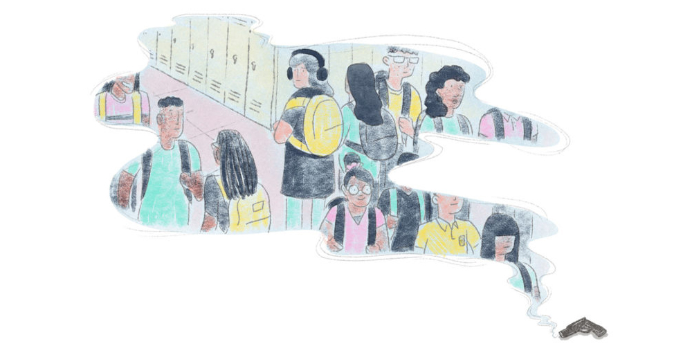
Our NodeXL #ddj mapping from Aug 27 to Sept 2 finds @nytclimate personalizing climate change, @npr fact-checking the US Education Department’s school shooting data, @dwnewscalculating the cost of travel to the environment, and @junkcharts dissecting the strengths of Thailand cave rescue data visualizations.
Climate Change, Personalized
The world is warming up because of human-induced climate change. But how much has it heated up in your hometown? See the effects of climate change, personalized, in this New York Times interactive.
Credit by - GIJN
If you like the story and if you wish more such stories, support our effort Make a donation.
Trending News

Sat May 30 2026 | By Newsdesk

Sat May 30 2026 | By Newsdesk

Sat May 30 2026 | By Newsdesk

Sat May 30 2026 | By Newsdesk
Sat May 30 2026 | By Newsdesk